

USER GUIDE
(How SBADNA INTEL DASHBOARDS Work)
SBADNA Dashboards are Easy, Fast, & Intuitive to use.
THE BASICS: Login Access
Go to: https://sbadna.force.com and select “Customer Login.”

Then enter your provided Email/Username and Password.

Don’t have a login? Click HERE to sign up.
THE BASICS: Category Navigation

There are 9 category tabs. The platform defaults to the Activity category tab.

When a category tab is selected a grouping of dashboards will appear underneath in the dashboard bar. For example, these are the 4 dashboards we have for the Activity category tab:
THE BASICS: Interconnected Filters
All filters are inter-connected. Our filters allow the specific details a user is looking for to be found easily and quickly. Some filters are dropdown selections and others are one click filtering.
For example, if you select “Project State: Texas” then all of the other filters will only show options for Texas. The Borrower cities and zip code filters will only show those for the state of Texas. The Bank names will only show bank names that approved a loan in Texas.
Each time you select multiple filters the other filters will then show fewer and fewer options as the search narrows.
There are two types of filters, dropdown filters and one-click filters.
Dropdown Filters
This dropdown filter section below is at the top of most dashboard reports.
Click the drop down filter and then either scroll and select or start typing until your result shows and then select. Then click apply.
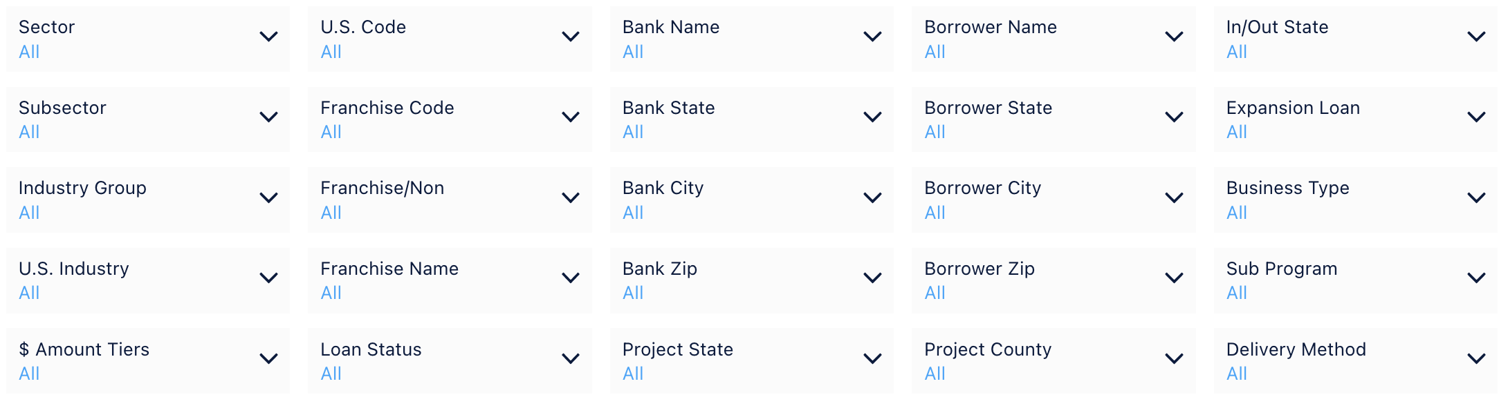
The 25 primary dropdown filters include:
You are able to select multiple options from each down filter and you can select multiple filters. This makes it easy and fast to filter the report for any combination of filters like: Dentists loans over $1 million in Houston, Texas. All of the drop down filters are interconnected with each other. This means if you select Project State: California then the rest of the filters will only show the counties, cities and zip codes for California. It would also only show Bank, Industry, and Franchise Names that have had SBA activity in California.
Dropdown Filters Summary:
U.S.Code
This is the same six digit NAICS code lenders enter into SBA’s ETRAN.
U.S. Industry
This is the same as the NAICS industry description entered into SBA’s ETRAN.
Industry Group
This filter uses the first 4 digits of the six digit NAICS code to determine the industry group. Industry groups consist of groupings of U.S. industries.
Subsector
This filter uses the first 3 digits of the six digit NAICS code to determine the Subsector. Subsectors consist of groupings of industry groups.
Sector
This filter uses the first 2 digits of the six digit NAICS code to determine the Sector. Sectors consist of groupings of subsectors.
$ Amount Tiers
Filter for loan amounts by tiers. Select one or select multiple tiers. If you want to see loans under $1 million for example select <$150,000 and then select $150,001 to $350,000, and then select $350,001 to $1,000,000 and select apply.
Franchise Code
This is the same franchise code listed in SBA’s franchise directory.
Franchise Name
Simply start typing the name of the franchise and results will start to pop up for your selection.
Franchise/Non
This filter allows for you to filter for franchise loans only as well as non-franchise loans only.
Loan Status
The platform defaults to all loan statuses but you can filter for any specific loan status(es). For example if you want to see loan activity without cancelled loans included then select CHGOFF, COMMIT and EXEMPT options and do not select CANCLD. If you only wanted to see cancelled loan activity then only select CANCLD and leave the others unselected. This dropdown filter shows:
CANCLD (Cancelled)
CHGOFF (Charge Offs)
COMMIT (Pending) - approved but not disbursed
EXEMPT (Active)
Bank Name
The name of the bank, non-bank, or credit union.
Bank State
The home state of the bank, non-bank, or credit union.
Bank City
The bank, non-bank, or credit union city as listed with the SBA.
Bank Zip
The bank, non-bank, or credit union zip code as listed with the SBA.
Project State
The state initials for the state reported as Project State.
Project County
The county and state initials reported as Project County.
Borrower Name
The name of the borrower logged into SBA’s ETRAN. We have not made any effort to fix typos, misspellings, or errors for this specific filter.
Borrower State
The home state of the borrower.
Borrower State
The home state of the borrower.
Borrower City
The city listed for the borrower.
Borrower Zip
The zip code listed for the borrower.
In/Out State
In state filters for only loans where Bank State and Project State are the same. Out state is when the Bank State is different from the Project State.
Expansion Loan
General term we use for loans where the Project State is different than the Borrower State.
Business Type
Enables you to filter for borrower by Corporation, Individual, and Partnership.
Delivery Method
Filter by specific SBA delivery method, for example PLP, SLA, OTH 7(a), SBA Express.
One-Click Filters
We have numerous one-click filter options. Depending on the dashboard there may be one, two, three, or more of these one-click filters just below the dropdown filter board.
TimeBar (One-Click)
Our TimeBar makes it easy and fast to see the report for different time periods.
All time periods are based on the calendar year except buttons with FY (Fiscal Year). FY period based on SBA’s fiscal year which ends September 30th. T12 is trailing 12 months (or last 4 quarters). T6 is trailing 6 months (or last 2 quarters). The 2, 5, and 10 year periods are based on a trailing or rolling basis and end at the most recent quarter updated.

THE BASICS: INTERACTIVE REPORTS
All lists are interactive and scrollable. Scroll over report segments for popup charts. Click and the entire report instantly changes to match your selection. For example, if you clicked the UPS Store bar then the whole report instantly becomes a UPS Store report.
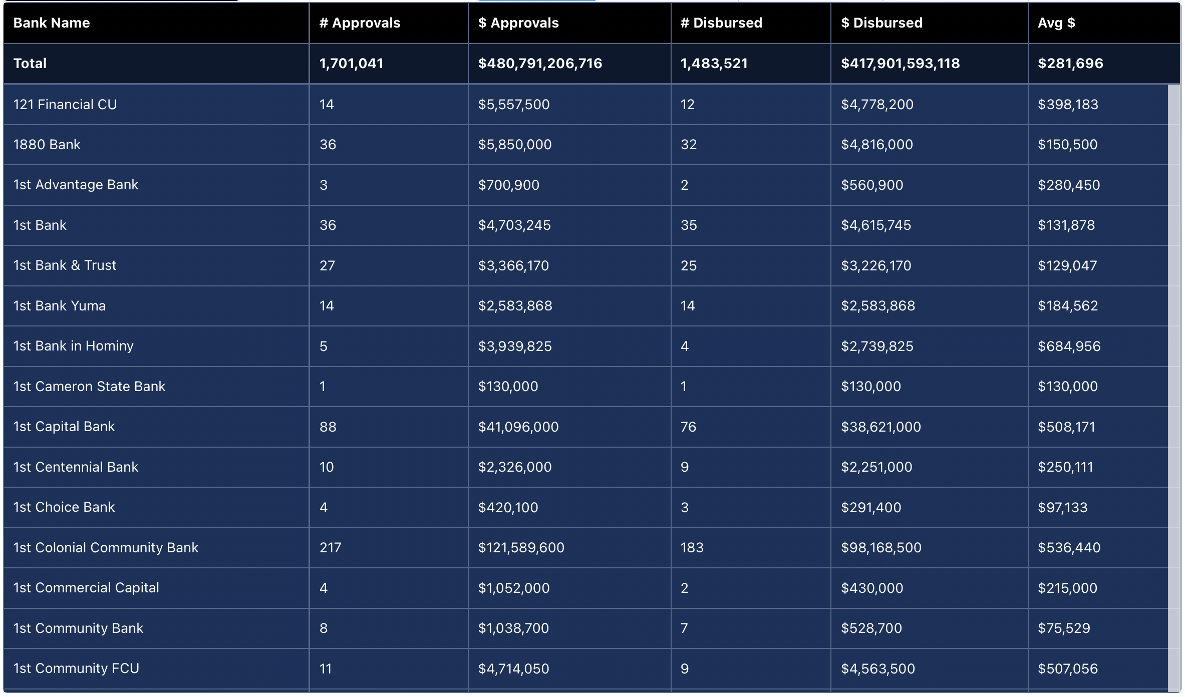
List Blocks
If you see a list like this, it’s scrollable. We keep most of our list blocks to 15 to 20 rows so you can see the top results and scroll to see the full list.
Ranking Bars
Ranking bars are interactive and inter-connected.
Scroll over a bar and a popup window will appear, scroll off and the popup goes away. If you click or tap the bar then the rest of the report instantly becomes a report on what you tapped. Click The UPS Store bar and now the top lenders, forecast, maps, everything changes to reflect only The UPS Store loans.
The window shows the bar results and the market share. That’s right, the market share for the bar result based on the filters selected.
See Marketshare for any combination of filters. For example, go to Lender Rankings and filter for 2021 and Project State Texas. Now filter for loans over $1,000,000. Now for loans over $1MM for food services and drinking places. X bank has X% of the approvals in Texas. Attention! If you select the top 10 button and market share shows 5% this is 5% of the top 10 market results. To see market share of 100% of the “market” being filtered then use the All and not a top rank filter.
Ranking bars are shown for number of loans and loan dollar amounts. The categories that have ranking bars in dashboards include: Lenders, Industries, Franchises, Project States, Project Counties, Borrower City, Borrower State, and Borrower City.


If you click on Texas, the entire report is now for Texas.

If you click on the 2021 bar, the entire report is now for 2021.
Marketshare: These pop-up windows show a portion or percentage of the total data you are viewing. Any pop-up like the ones below will always be displaying additional marketshare details.


And if you selected all of these examples then the report would show SBA lending for The UPS Store franchise brand for the project state of Texas, in the calendar year of 2021, for loans under $150,000.
SBADNA members can easily save their favorite filters as custom “Views” for frequently used Dashboards instead of re-entering the filters when they log in, change Category, or refresh their internet browser page.
THE BASICS: CUSTOM VIEWS
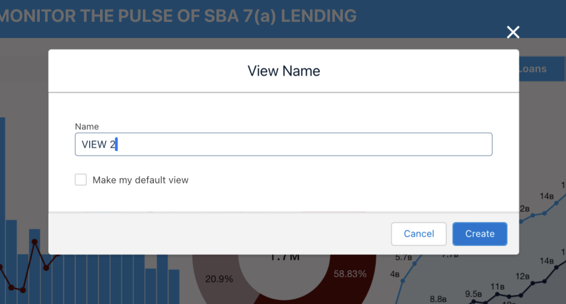
STEP 1: After you have applied the filters you want to save, start by locating and selecting the “My Views” dropdown. There, you will have a prompt to select “Save View”.
STEP 2: Enter your preferred View name and click “Create.” You will also be able to check the box that would make this particular view the default for this Dashboard category.
STEP 3: A green pop-up in the header will display a properly created/saved Dashboard View.

STEP 4: Using the same “My Views” dropdown from Step 1, you can now load a pre-saved View, save a new View, and manage/edit your existing Views.

THE BASICS: SAVING & SHARING
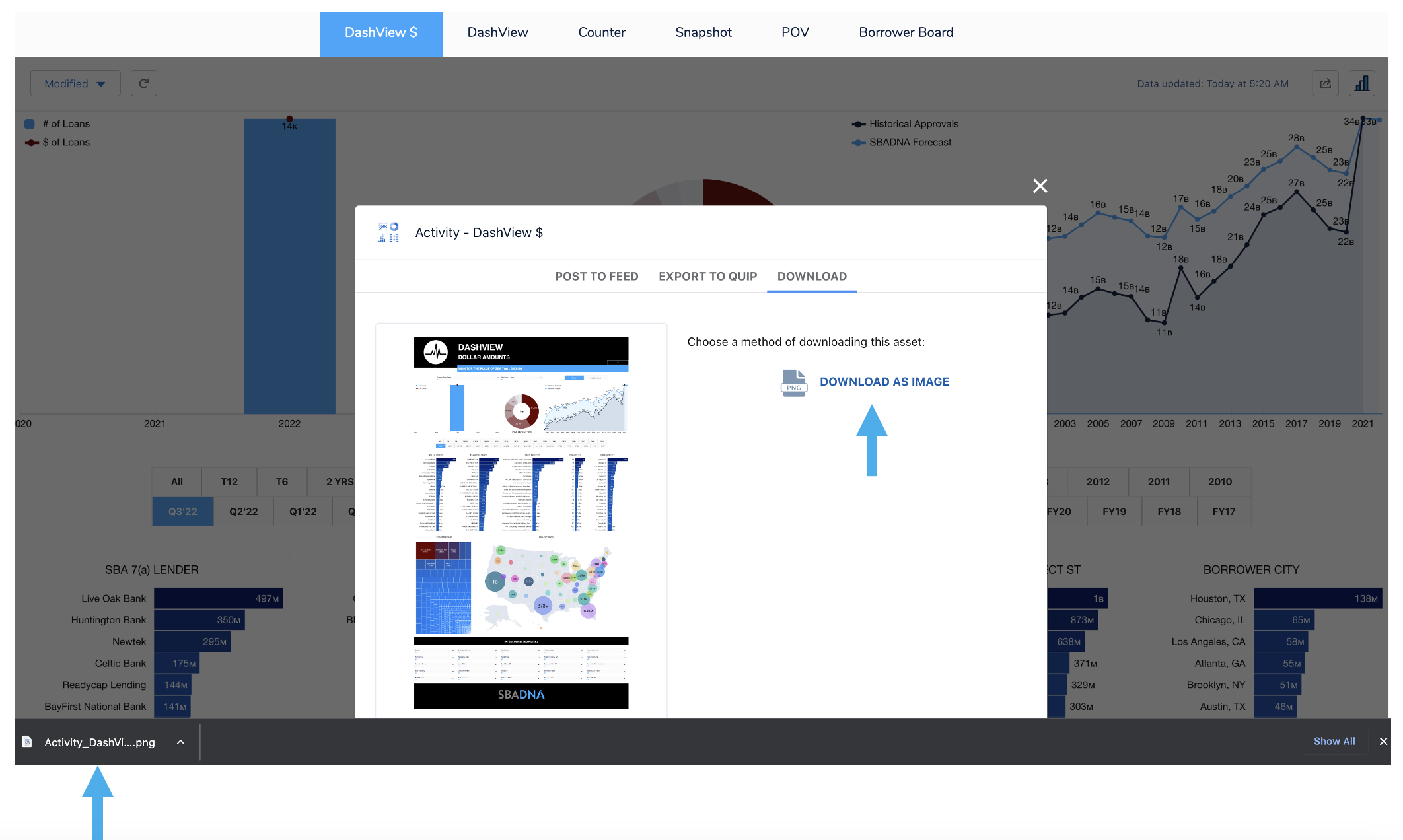
It’s easy to save and share within the Dashboards. You can save an entire Dashboard as an image. Or you can save any of the individual charts, graphs, maps, and lists as a .PNG image or download in Excel/CSV format. They will have a hidden white box arrow button that pops up when you scroll over the chart/graph/map/list.
Download Entire Dashboard
Step 1: Click the Share button on the top right of the dashboard header.

Step 2: This screen pops up after the Share button is clicked.
Select “DOWNLOAD”
Note: The “Post to Feed” and “Export to Quip” functionalities are still undergoing testing and are non-functional at this time.

Step 3: Next, click the “DOWNLOAD AS IMAGE” button to save a .PNG image of the entire Dashboard to your computer.
Note: Sometimes you may have to zoom your screen in/out for all of the fields to populate on the image.
Download Individual Elements
You can also save as an image or download in Excel/CVS format any of the individual charts, graphs, maps, and lists that have the “Share” white box arrow button. This is a hidden button that will popup when you scroll over the chart/graph/map/list.
Step 1: Hover over the chart/graph/map/list and this arrow button appears on the top right side.
Click the arrow button and then the subsequent “Share” button that appears.

Step 2: Select “DOWNLOAD” then click which file type you want to save it as: PNG Image, Excel, or CSV format options.

Print Entire Web Page
Step 1: In order to quickly print the whole page, start by clicking the “3 Bars” icon on the upper right corner next to the “Share” icon.

Step 2: Then click the down arrow and select “Print Preview”.

Step 3: Follow your computer’s standard Print or PDF Save methods like any other document.

DASHBOARD OVERVIEWS: ACTIVITY
There are six Activity Dashboards:
DashView $
DashView
Counter
Snapshot
POV (Point of View)
Borrower Board
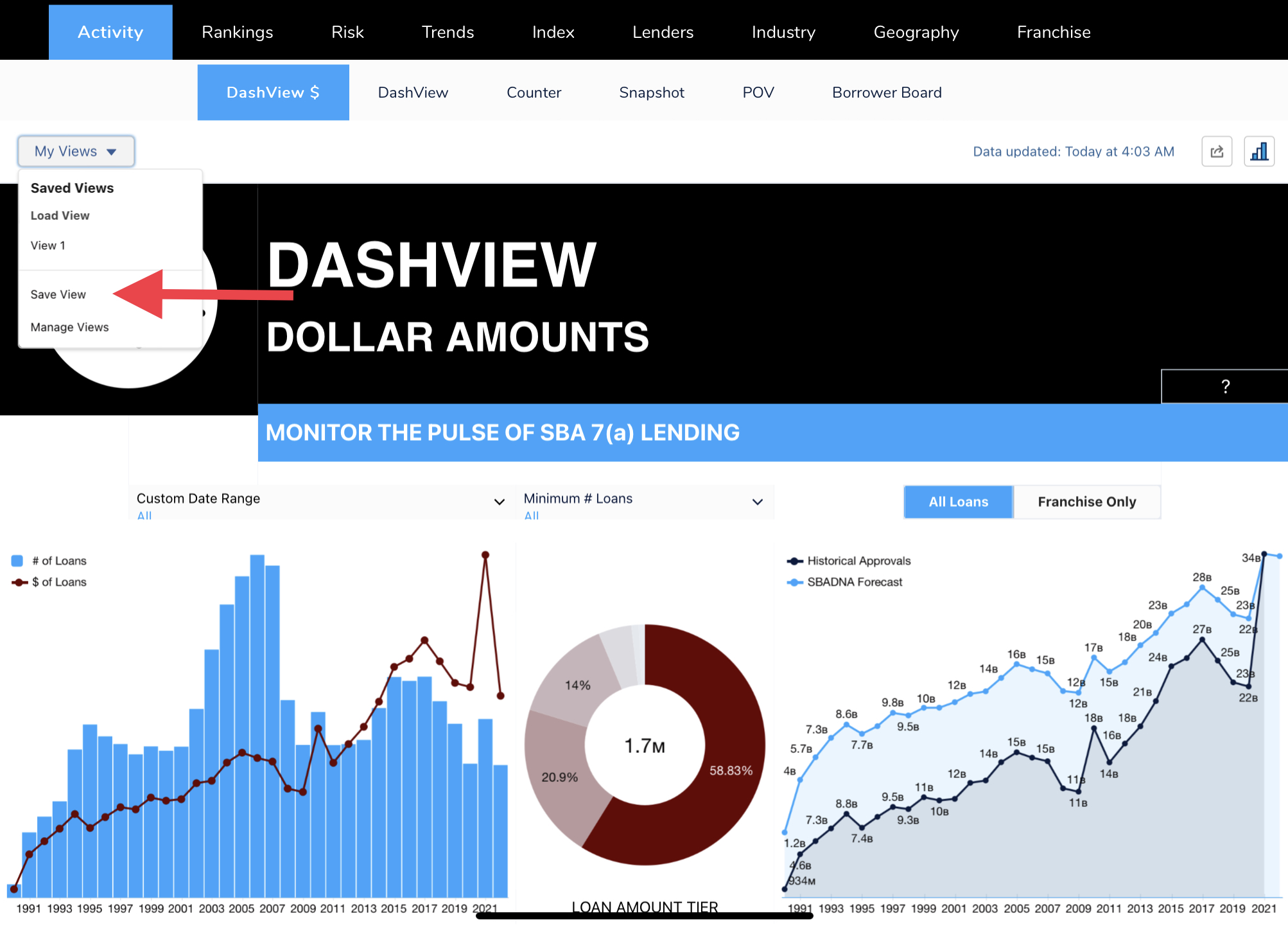
DashView $
(Click Image To Expand Dashboard)
DashView
There is a reason the SBADNA Dashboard sets the DashView report as the first dashboard report you see. DashView is ideal to use to keep your finger on the pulse of SBA lending on about anything. Select a filter or click on any chart or graph and the entire dashboard instantly becomes a report on what you selected.
(Click Image To Expand Dashboard)
Counter
No charts, graphs, or thrills, just numbers. When you need to know a specific number or amount this dashboard instantly outputs what you want to know.
(Click Image To Expand Dashboard)
Snapshot
This dashboard has most of the same graphs and charts as DashView. The difference is Snapshot shows the charts and graphs full size. This is the dashboard to use when you want to play with a chart or graph up close and full screen.
(Click Image To Expand Dashboard)
POV (Point of View)
This dashboard provides activity lists based upon your filter selections. See SBA loan approvals, amounts, average loan amount, disbursed, PIF and charge-off activity for lenders, franchises, industries, and by geography.
(Click Image To Expand Dashboard)
Borrower Board
(Click Image To Expand Dashboard)
DASHBOARD OVERVIEWS: RANKINGS
The Ranking Dashboards focus on top rankings in SBA lending based on the filters selected. Rank anything, for anywhere, for any time period, for any filter combination. Instantly see top rankings for the number of loans approved and approved amounts.
There are 5 ranking dashboards:
Top 20
Lender
Industry
Geography
Franchise
Top 20
This dashboard is ideal when you want to see the top ranked lenders, franchises, industry groups, U.S. industries, project state and borrower city rankings all on one page.
Remember, everything is interactive and interconnected. If you select Wells Fargo for example the entire report is now a Wells Fargo top 20 report.
(Click Image To Expand Dashboard)
Lender
Quickly see the top lenders for any combination of filters. See how lenders rank for seemingly countless combined filter variables.
Your Banks Intel:
Use different combinations of filters to see what your bank is top ranked for. If you are not a top 20 national lender that doesn’t mean you’re not ranked for what is most important to your customers.
A borrower may care more that your bank is not only local but is a top 10 SBA lender in your state that is also a top lender for the same industry the prospective customer is in.
It would be nice to know (and now easy to find out) and be able to tell a customer that for their state/city/county/zip for their sector/subsector/industry group/U.S. industry, for franchise/non-franchise, and for their specific loan amount tier your bank is a top ranked SBA lender. Your bank may be top ranked in one or multiple of these particular categories but this dashboard will help you find and tout whatever your bank is top ranked for.
As you use the filters to narrow down, scroll over your bank’s ranking bar to see marketshare your bank has. If it’s a good percentage then sharing that your bank is not only experienced but has a 45% marketshare of loans in their industry and loan amount tier in your state, county or city gives added credibility to the business owner that your the right bank for them.
This dashboard allows for you to find the micro rankings that match your target customer. Micro rankings are more meaningful to more small business owners than national macro rankings.
Want proof? Ask a small business owner needing a loan which means more to them in selecting an SBA lender:
A national top 20 SBA lender.
A top SBA lender in their state/county/city, for their industry, and their loan amount request.
Of course, if you’re a top ranked national lender AND have the top micro rankings that match your prospect then even more powerful.
(Click Image To Expand Dashboard)
Industry
Industry Rankings rank the NAICS U.S. industry six digit name description. This is the same NAICS industry description lenders enter in SBA’s ETRAN.
See how different industries rank for SBA lending by state, loan amount tier, and any other combination of filters you choose.
Quickly see rankings over different time periods, research how the industries you focus on are ranked and explore industries doing a lot of SBA volume that you may wish to start targeting.
See the hottest industries by timeline, flipping through quarters.
Try filtering industry rankings by industry group, subsector and sector.
Click an industry ranking bar and click through the timeline buttons to see how rankings fluctuate.
(Click Image To Expand Dashboard)
Geography
This dashboard provides Project State, Project County, Borrower City, and Borrower Zip Code rankings based upon your filter selections. Just click the “State”, “County”, “City” and “Zip” buttons to see rankings for number of approved loans and loan amount dollars approved.
Use this dashboard to select your combination of filters and then be able to click onto state, city, county, and zip seamlessly to see results for each.
Your Bank’s Intel:
Use this dashboard to dive into your bank or territory’s geo footprint. Use the Bank Name filter to select your bank’s name and get an instant and clear picture of where your bank has focused on or had the most success with.
Competitive Intel:
Have a competitor you always seem to be going up against? Use the Bank Name filter and select the bank’s name. If there is a specific industry or franchise brand you want to see, select those filters. Once you select the bank name the entire report is now all of the locations that bank has approved SBA 7(a) loans…for any time period, including last quarter, and for any other filters you select.
Research New Markets:
Analyze the hottest markets anywhere based on any filter combinations to explore other markets to consider new geographical areas of focus.
(Click Image To Expand Dashboard)
(Click Image To Expand Dashboard)
(Click Image To Expand Dashboard)
Franchise
(Click Image To Expand Dashboard)
DASHBOARD OVERVIEWS: RISK
The Risk Category has three historical risk dashboards.
Charge-Off DNA
Charge-off Dashboard
Risk Counter
Charge-Off DNA
This dashboard is a serious game changer for enabling lenders to make more informed risk decisions.
(Click Image To Expand Dashboard)
Click which 10-year period you want to see:
Click through the 4 charge-off reports:

Select the NAICS 6 description or 6-digit code or franchise brand:


Or view by industry group or subsector for more context:
Use the filters to get a more informed risk perspective. Charge-off numbers and ratios for states, loan amounts, counties and cities, and in multiple combinations, can be drastically different than the national average of all loans nationwide for the industry.
Here is a very small sample of how charge-off data changes when you look at other key factors other than just the national average. The column on the left are examples of how the percentage of loans charged off can vary with just one filter and on the right side with just two filters.
Example:
Limited-Service Restaurants
Ten-Year Period: 2011-2020
Percentage of Loans Charged Off
National Average Charge-Off Percentage: 4.28%
Just adding one filter can substantially change charge-off ratios. Below is an example of the difference when applying just one of these filters.
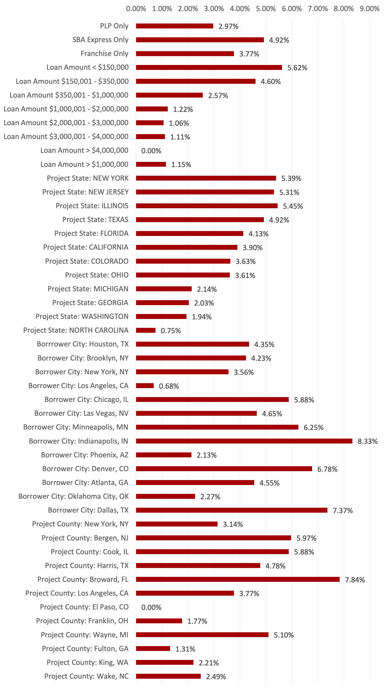
Example changes with one filter:
(Click Image To Expand Graph)
Adding two filters like state and loan amount tier can be more revealing about true risk ratios than just a national industry ratio. Below is an example of how the ratio changes when applying varying state and loan amounts.
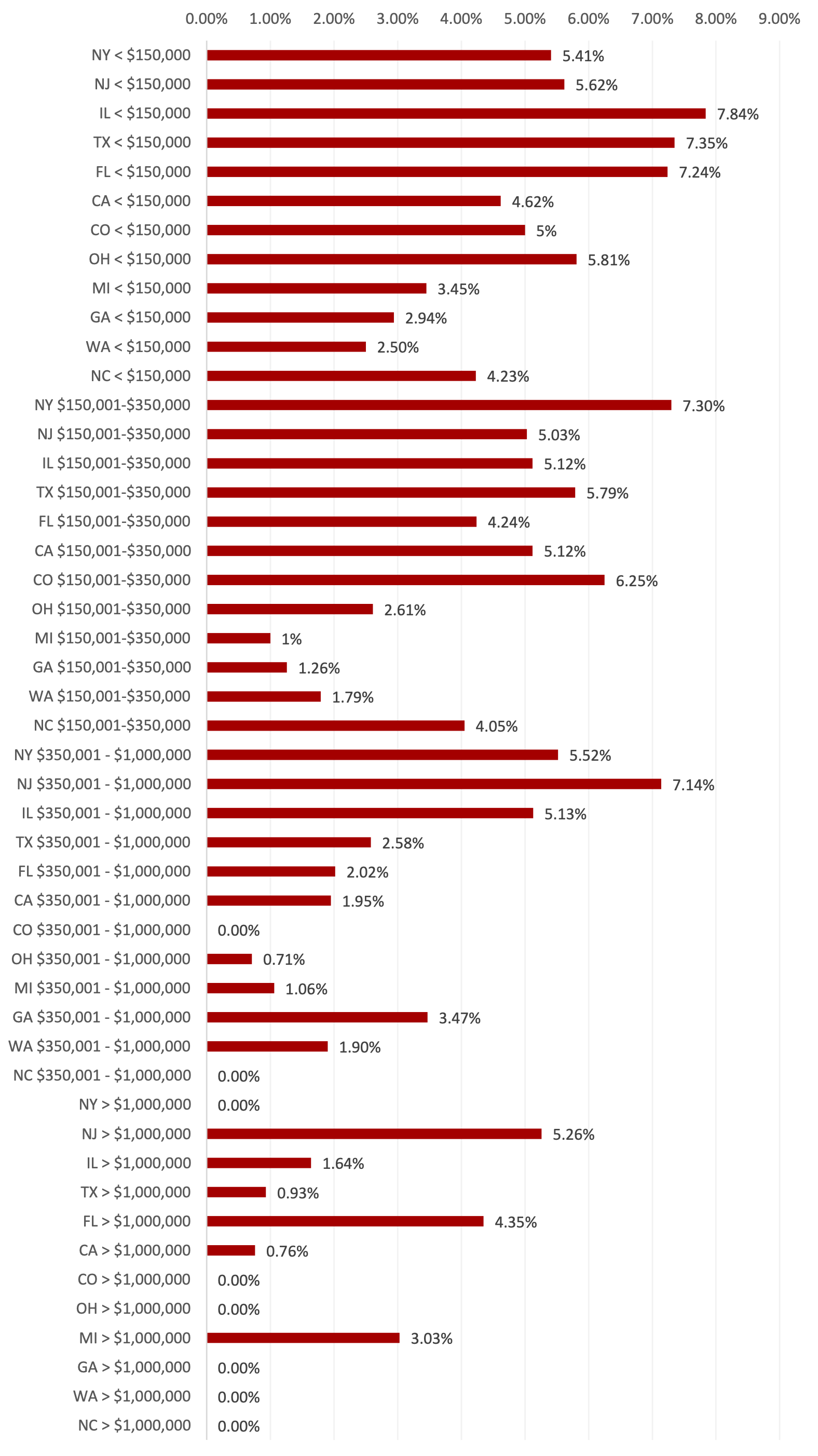
Example changes with two filters:
(Click Image To Expand Graph)
Note: There are 25 filters containing thousands of drop-down option combination selections. Of course, the more you drill down the smaller the sample size.
Charge-off Dashboard
The only difference between this dashboard and the Charge-off DNA dashboard is the layout. This dashboard allows you to see everything broken out on one page at the same time. If you click on one of the chart bars, then the rest of the report will show results for only the bar you selected.
(Click Image To Expand Dashboard)
Risk Counter
(Click Image To Expand Dashboard)
DASHBOARD OVERVIEWS: TRENDS & FORECASTS
“The goal of forecasting is not to predict the future but to tell you what you need to know to take meaningful action in the present.”
~ Paul Saffo
Knowing where the puck is headed helps make more informed decisions regarding strategic planning, business development, marketing, hiring, risk assessments, and expanding into new industries and geographical markets.
SBADNA provides YOY, TTM YOY, 3 Year Trend, 10 & 5 year growth trend forecasts, and a time series forecast model. All trend and forecast model formulas are listed in the FAQ within the Intel Dashboards.
There are 7 Trends & Forecasts dashboards:
Trends DNA
Lender Trends
Industry Trends
Geo Trends
Franchise Trends
Charge-off Trends
Forecast Model
Trends DNA
This dashboard has multiple sub-dashboards including:
Lender Activity
See, rank and filter for lender trends and forecasts for number of loans and dollar amounts.
Biggest Jumps
Shows the industry groups, U.S. industries and franchise brands that have the biggest trend and forecast increases.
Biggest Drops
Shows the industry groups, U.S. industries and franchise brands that have the biggest trend and forecast decreases.
Geography
Ranks the highest trends and forecasts for project state, project county, borrower city, and borrower zip code.
(Click Image To Expand Dashboard)
Lender Trends
Lender Trends dashboard allows you to enter your bank and another lender’s name and compare trends and forecasts based on any combination of filters next to the top 100, 50 and 20 lender indexes as well as all lenders.
(Click Image To Expand Dashboard)
Industry Trends
Industry Trends dashboard allows you to enter your bank and another lender’s name and compare trends and forecasts for industry lending based on any combination of filters next to the top 100, 50 and 20 lender indexes as well as all lenders.
(Click Image To Expand Dashboard)
Geo Trends
Geo Trends dashboard allows you to enter your bank and another lender’s name and compare trends and forecasts for project states and counties as well as borrower cities and zip codes based on any combination of filters next to the top 100, 50 and 20 lender indexes as well as all lenders.
(Click Image To Expand Dashboard)
Franchise Trends
Franchise Trends dashboard allows you to enter your bank and another lender’s name and compare trends and forecasts for franchise brands based on any combination of filters next to the top 100, 50 and 20 lender indexes as well as all lenders.
(Click Image To Expand Dashboard)
Charge-Off Trends
Charge-off Trends dashboard allows you to enter your bank and another lender’s name and compare trends and forecasts for charge-offs based on any combination of filters next to the top 100, 50 and 20 lender indexes as well as all lenders.

(Click Image To Expand Dashboard)
SBADNA Forecast Model
SBADNA’s forecast model is based on a time series forecast using the Holt-Winters Forecasting model with Triple Exponential Smoothing. The forecast is calculated as a weighted average of all historical data and recent data is weighted exponentially higher than older data.
While the SBADNA Forecast isn’t as accurate as a crystal ball, it is more fun. Get the instant visual of the historical SBA loan activity and trajectory transition to what is forecasted.
There are 25 drop down filters to narrow forecast results. You can use one filter or multiple filters. Each of these filters allow for one or multiple selections.
See the forecasts for a virtually endless combination of filter options - approval dollars for a specific lender, industry, franchise brand, or state, county, city and zip code…in any combination.
The more you filter the less data there is available for forecasting. Fewer data points make for bigger swings and discrepancies in the forecast results.
Even so, you’ll still usually get the general picture of what the trajectory looks like.
(Click Image To Expand Dashboard)
See the forecast for one lender. For example, Huntington Bank:
(Click Image To Expand Dashboard)
Or for multiple lenders. For example, Huntington Bank + Newtek:
(Click Image To Expand Dashboard)
See the forecast for any NAICS U.S. Industry (6 digits), Industry Group (4 digits), Subsector (3 digits) and Sector (2 digits). For example, Limited-Service Restaurants:
(Click Image To Expand Dashboard)
See the forecast based on loan amount tier. Select one or multiple tiers. For example, $1M-2M:
(Click Image To Expand Dashboard)
See specific States and/or Counties. For example, Harris County, TX:
(Click Image To Expand Dashboard)
Trends & Forecasts Formulas:
YOY
This is year over year for the last calendar year over the prior calendar year. Currently YOY shows 2021 over 2020.
TTM YOY
This is year over year with the most recent year ending at the most recent quarter’s data. Currently TTM YOY is from 7/1/2021 – 6/30/2022 over the previous year of 7/1/2020 – 6/30/2021.
Three-Year Trend
This is year over year for the last calendar year over the prior last 3 calendar year. Currently YOY shows 2021 over 2019.
Forecast 10
Compound Growth Rate for Next Year Forecast
This is year over year for the last calendar year over the prior last 10 calendar year. Currently YOY shows 2021 over 10 Year ago YOY(2012).
Forecast 5
Compound Growth Rate for Next Year Forecast
This is year over year for the last calendar year over the prior last 5 calendar year. Currently YOY shows 2021 over 5 Year ago YOY (2017).
dashboard overviews: index
The SBADNA Top Lender Indexes provide a unique perspective for comparing and benchmarking historical, trending and forecasted SBA lending activity with the average top lender.
Indexes are also found in the trends & forecasts dashboards, but this Index category has one dashboard and the index lender listings.
Index Benchmarking
Index Listing
Index Benchmarking Dashboard
We created three top lender indexes:
Top 100 Lender Index
Top 50 Lender Index
Top 20 Lender Index
The top lenders in the indexes are determined based upon the top rankings for gross loan approval dollars over the rolling twelve months, updated quarterly. Currently, the top index lenders were selected based on data through 6/30/2022.
This dashboard is an intel generating factory all to itself allowing for unprecedented benchmarking. The indexes show the average (not sum) of the index lenders. For example, the 50 Index will show the results as if all 50 top lenders where averaged into one bank, the typical top 50 lender.
Just type in your bank name and compare side-by-side with the average top 100, top 50 and top 20 lenders as well as the “All Bank” average. Use any combination of filters to compare your bank’s historical, recent, trending and forecasted SBA lending activity with the rest of the lenders (1600 last year).
Click the year or time period to compare historical lending. Benchmark your banks trends and forecasts for industry, loan amount, franchise brand, or state, county, city, and zip and a host of other key comparable.
FDIC and NCUA columns only have data for the last two years (when the data was added to FOIA data released).
(Click Image to Expand Dashboard)
INDEX LISTING
The listing of the Top 20, 50, and 100 lenders in our current indexes are listed here.
The top lenders in the indexes are determined based upon the top rankings for gross loan approval dollars over the rolling twelve months, updated quarterly.
Currently, the top index lenders were selected based on data through 9/30/2022.
(Click Image To Expand Dashboard)
DASHBOArD OVERVIEWS: LENDERS
While extensive intel is found on lenders through other dashboards, the Lender category has these 5 Dashboards:
Lender DNA
Lender Compare
Lender Activity
Lender Rankings
Geo Portfolio
Lender DNA
This dashboard is designed to provide a detailed but graphic-rich intel about a lender’s loan portfolio. Select bank name in the dropdown menu and click through the different sub-category buttons.
Sort by loan status.
The far-right dropdown filter changes to match the sub-category selection. You can click on the down arrow and the popup dropdown menu opens. Scroll through the selections and if you want to see the results for that specific item then select.
Scroll through the list detail, see our forecast shows, as well as timeline chart, loan amount tier pie charts, and state heat map.
Because of the nature of this specific dashboard the charts will change color when selected but they will not change any other chart or graph.
(Click Image To Expand Dashboard)
Lender Compare
This dashboard compares two lenders side-by-side for any combination of filters.
See the key comparisons on SBA loan activity and side-by-side charts and graphs.
(Click Image To Expand Dashboard)
Lender Activity
This dashboard provides a sortable and scrollable lender listing based on any combination of filters.
(Click Image To Expand Dashboard)
Lender Rankings
See lenders ranked for about anything, anywhere, for any time period, in multiple filter combinations.
Scroll over the ranking bar to see the lender’s percentage or market share of the filter results. For example, when you filter for 2021 and franchise only loans, and scroll over United Midwest, you can see they had 10.44% of all the franchise loans approved in 2021.
If you select the top 10 filter and then scroll over United Midwest the market share changes to 31.35% to reflect the market share of the top 10 lenders.
At the bottom of the dashboard are two tree maps for number and dollar amounts.
(Click Image To Expand Dashboard)
Geo Portfolio
Select bank name and see lending activity by project state, project county, borrower city and borrower zip.
Scroll through the list detail, see our forecast shows, as well as timeline chart, loan amount tier pie charts, and state heat map.
(Click Image To Expand Dashboard)
DASHBOArD OVERVIEWS: INDUSTRY
While extensive intel is found on lenders through other Dashboards, the Industry category has these 4 Dashboards:
Industry DashView
Industry DNA
Industry Activity
Industry Rankings
Industry DashView
(Click Image To Expand Dashboard)
Industry DNA
This dashboard shows you most everything you would want to know when researching industries you’re currently focused on, planning to target, or reveal industries that you were unaware are hot with other lenders right in your back yard.
Industry DNA lists out the industries in sortable and scrollable list, timeline chart, forecast, loan amount tier pie chart, and state maps. Charts and graphs are interactive (if you click the sate of California then the rest of the report only shows results for California).
NAICS Description is the six-digit NAICS code/description.
(Click Image To Expand Dashboard)
Industry Activity
This dashboard provides a sortable and scrollable industry listing based on any combination of filters.
(Click Image To Expand Dashboard)
Industry Rankings
See industries ranked for about anything, anywhere, for any time period, in multiple filter combinations.
Scroll over the ranking bar to see the industry’s percentage or market share of the filter results.
At the bottom of the dashboard are two tree maps for number and dollar amounts.
(Click Image To Expand Dashboard)
DASHBOArD OVERVIEWS: GEOGRAPHY
This Category enables you to see geographic SBA lending trends and forecasts based on any combination of filters.
Geo DashView
Geo DNA
Geo Activity
Geo Portfolio
Geo DashView
(Click Image To Expand Dashboard)
Geo DNA
(SHOW “GEO RANKINGS PROJECT STATES”)
This dashboard shows you most everything you would want to know when researching SBA lending based on geographical areas.
See lending activity by project state, project county, borrower city and borrower zip.
Scroll through the list detail, see our forecast shows, as well as timeline chart, loan amount tier pie charts, and state heat map.
Use interactive project county maps for precision geo-based intel.
Where should you be allocating marketing resources? What does SBA lending look like in an area you’re looking to expand? Use combinations of filters to target with more precision.
Geo DNA lists out the states, counties, cities and zip codes in sortable and scrollable list, timeline chart, forecast, loan amount tier pie chart, and state maps.
Charts and graphs are interactive (if you click the Sate of California then the rest of the report only shows results for California.
(Click Image To Expand Dashboard)
Geo Activity
This dashboard provides a sortable and scrollable listings for states, counties, cities and zip codes based on any combination of filters.
(Click Image To Expand Dashboard)
Geo Portfolio
(Click Image To Expand Dashboard)
DASHBOArD OVERVIEWS: FRANCHISE
In addition to the Franchise Dashboards below, franchise intel can be found throughout the SBADNA platform.
Every Dashboard on the SBADNA platform has the one-click “Franchise Only” filter. Select and everything instantly turns into a franchise brand SBA lending report.
Every Dashboard also has these franchise drop down filters:
Franchise Name
Franchise Code
Only Non-Franchise
The Franchise Dashboards:
Franchise DashView
Franchise Activity
Franchise DNA
Franchise Compare
Franchise Directory
Franchise DashView
(Click Image To Expand Dashboard)
Franchise Activity
This dashboard provides a sortable and scrollable industry listing based on any combination of filters.
(Click Image To Expand Dashboard)
Franchise DNA
This dashboard shows you most everything you would want to know when researching SBA lending for franchise brands from more angles than you may care to know.
See the new and upcoming franchise brands in SBA lending activity by monitoring for each quarter reported (we update each quarter). See on a national level or for your state or for any filter combination.
Franchise DNA lists out the franchise brands in sortable and scrollable list, timeline chart, forecast, loan amount tier pie chart, and state maps.
Charts and graphs are interactive (if you click the Sate of California then the rest of the report only shows results for California).
(Click Image To Expand Dashboard)
Franchise Compare
This dashboard compares two franchise brands side-by-side for any combination of filters.
See the key comparisons on SBA loan activity and side-by-side charts and graphs.
(Click Image To Expand Dashboard)
Franchise Directory
The SBA franchise list posted here and updated as of 3/31/2023.
(Click Image To Expand Dashboard)
GLOSSARY OF TERMS

You can access relevant information including glossary terms inside each Dashboard.
If you can’t find the answers you’re looking for, you may contact us HERE.